User documentation can help your customers fall in love with your product.
It’s the ultimate source of information about your product, shaping how your users think about it, use it, and gain value from it.
Creating great user documentation is challenging, but we have good news for you—there are certain features that make documentation great.
In this article, we’ll examine those features and help you create stellar user documentation.
Let’s get started!
A Logical Hierarchy
One of the features of great user documentation is its meticulously executed hierarchy of topics and resources.
If you just throw resources together without any logical order or structure, how will your users find the information they need?
You probably know the answer, but here’s a reminder just in case—with a lot of frustration and wasted time.
A logical hierarchy is important to make the documentation more helpful. But what does it mean to have such a hierarchy?
Ritendra Datta, a director of engineering at Facebook, explains what it means to have a hierarchical document structure:
Write your document structure hierarchically, starting with the most fundamental concept, idea, finding, etc. and then progressively unraveling the details.
In other words, your users will follow the documentation more easily if you present the basics before moving on to more advanced features and topics.
For example, Ghost, a software for creators, organized its user documentation into four parts.
The first part consists of guides and tutorials for those new to the product.
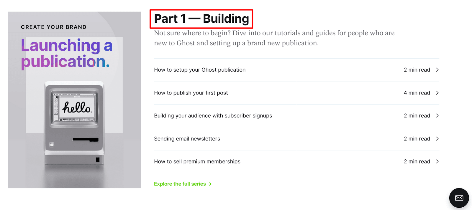
Source: Ghost
Those documents contain the basic knowledge that every user should master before moving on to the other parts of the documentation.
Ghost’s documentation continues with the second part dedicated to publishing with the help of the software, then the third part, which is about growing the audience, and concludes with the fourth part with actionable ideas for creators on how to build recurring revenue.
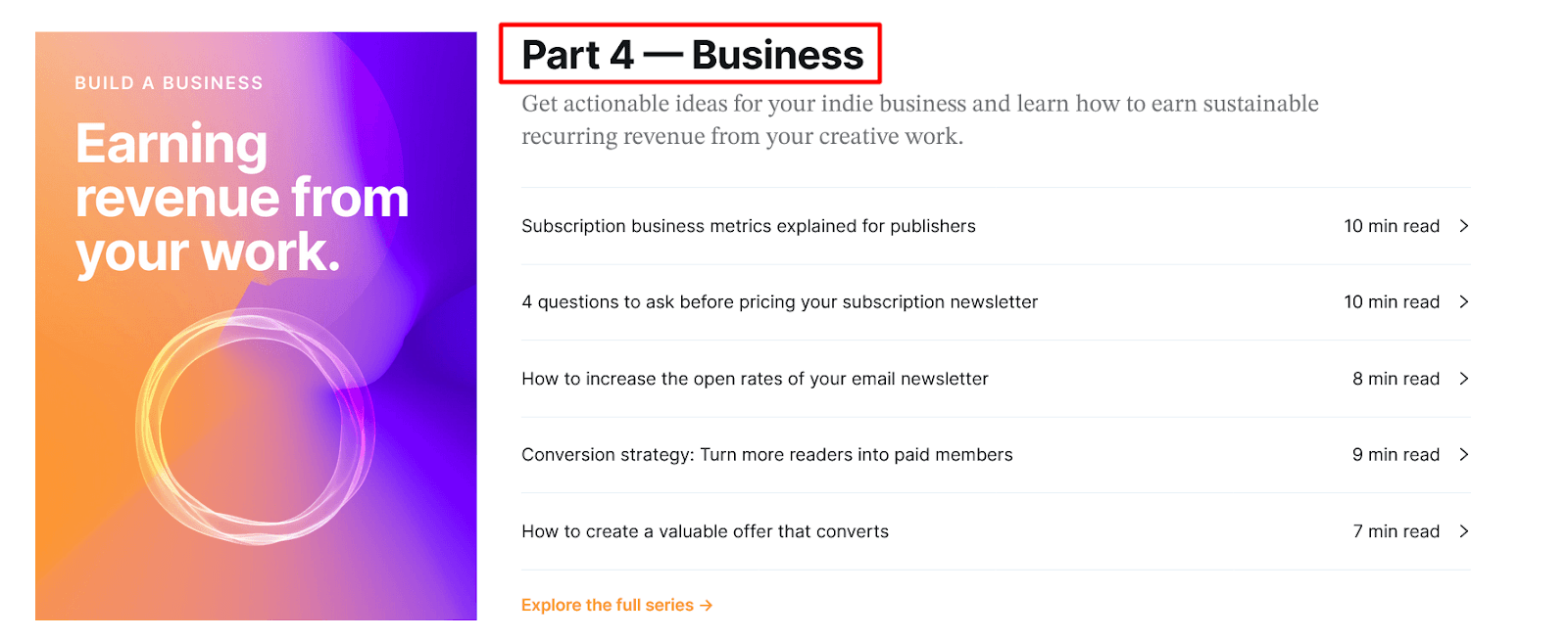
Source: Ghost
The point is that the order in which the content is presented in the user documentation should follow a certain logic.
If Ghost organized their documentation so that the first guides were about acquiring paid members, then moved on to building an audience, and concluded with a series of guides about publishing your first post, their documentation would be more reminiscent of a random assortment of facts than a helpful resource.
A logical hierarchy can be presented in various ways. For example, take a look at Drift’s documentation built with Archbee.
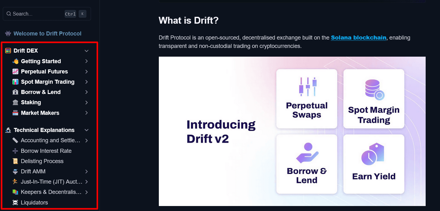
Source: Drift
On the left-hand side, you can see a document tree.
Archbee uses that method of document organization to present categories, subcategories, and documents within them effectively.
As you can see in the screenshot above, the categories begin with the “Getting Started” guide and other fundamental information needed for successfully using Drift.
What follows is technical information, developer resources, security, legal documentation, and a glossary at the end.
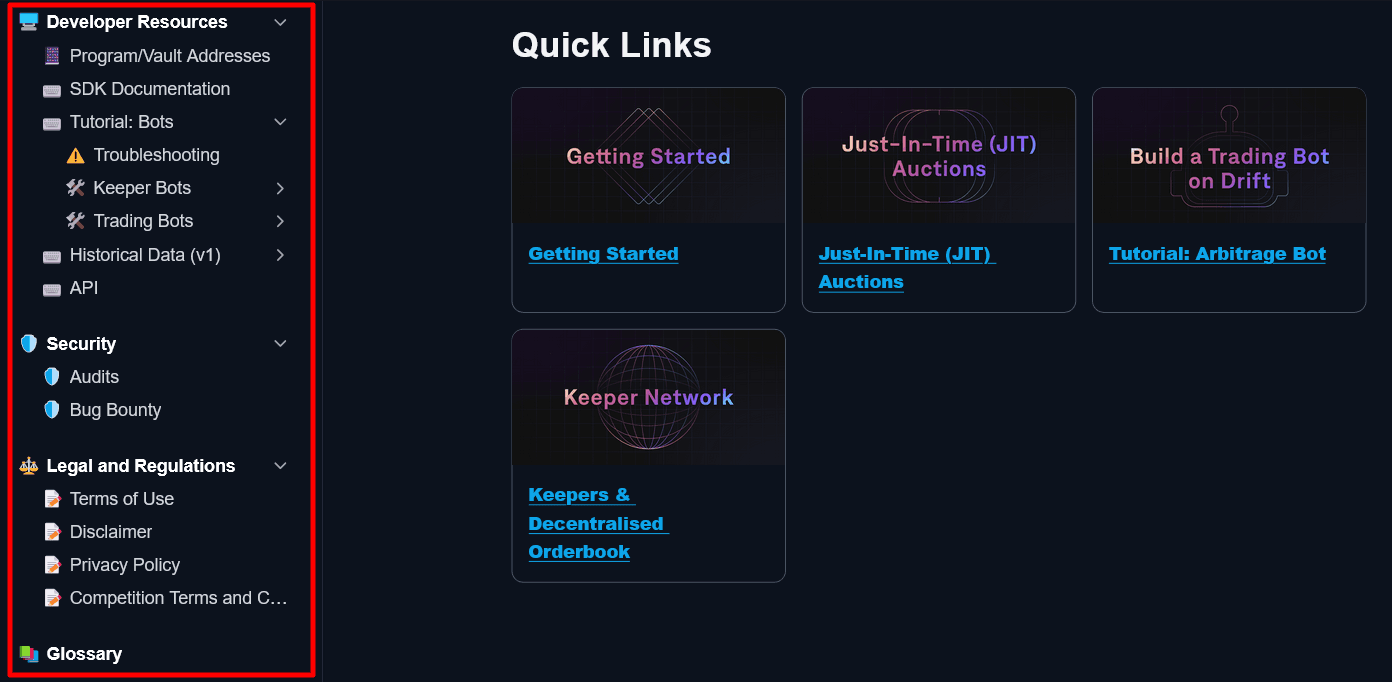
Source: Drift
If you use Archbee, building a hierarchy like that is easy—even if you change your mind about where to place particular resources, you can rearrange them with a simple drag-and-drop system.
That way, your users can find their way around your documentation without any issues.
Defined Use Cases
It’s not uncommon for user documentation to be very extensive.
Software products usually have multiple features, options, and functions, so covering them in detail takes time and effort.
Furthermore, it can also be challenging for users to find what they need in all of that content.
Your product might be like a software equivalent of a Swiss Army Knife, with multiple purposes for different situations, but the user might need to learn about only one.
How can you make it as simple as possible for your users to find the information relevant to their needs? One of the solutions is to present them with use cases.
For instance, Monday, a project management software, is very versatile. Therefore, they presented various ways the customers could use their product.
More precisely, they presented 43 different use cases, including team management, inventory tracking, video production management, etc.
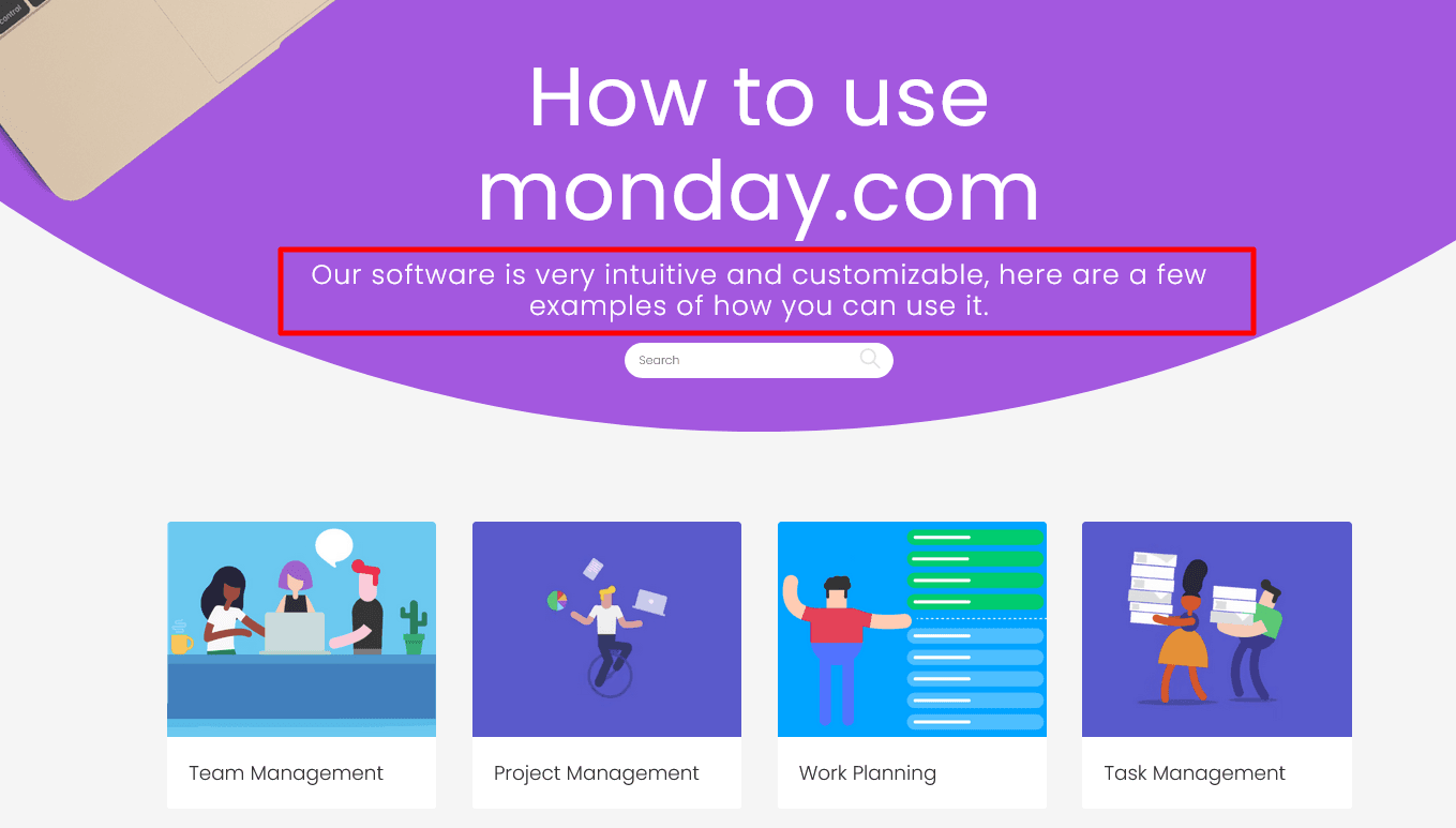
Source: Monday
If you have a multipurpose product like Monday, presenting use cases can save your users the time they would otherwise spend figuring out if the product was even suitable for their needs.
For example, if a user wants a solution for workflow management, on Monday’s page, they can learn how to use that product for that exact purpose.
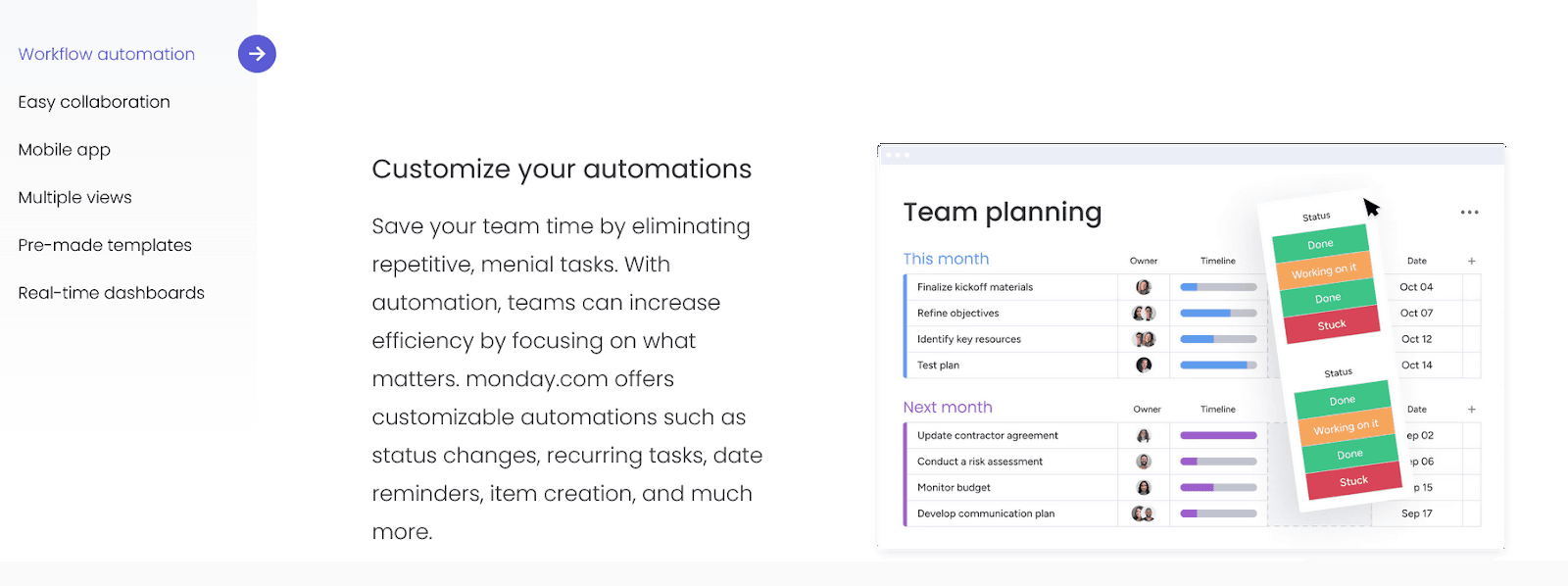
Source: Monday
And not every use case page Monday created has the same type of content for users.
For instance, a page about managing tasks provides an FAQ section, a standard part of most great user docs.
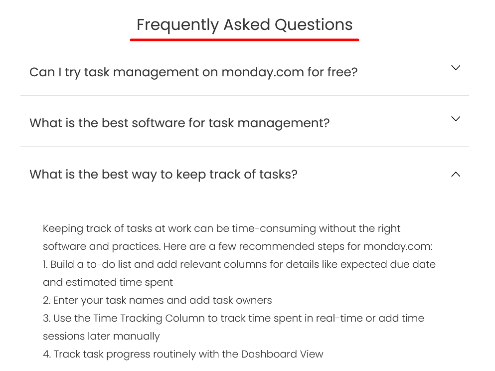
Source: Monday
Presenting use cases is also an excellent opportunity to point readers toward the other parts of your user documentation.
Let’s take a look at how Scribe, a screen capture and documentation tool, does it.
They present multiple use cases for their product and, after each one, add a few links to the relevant user guides.
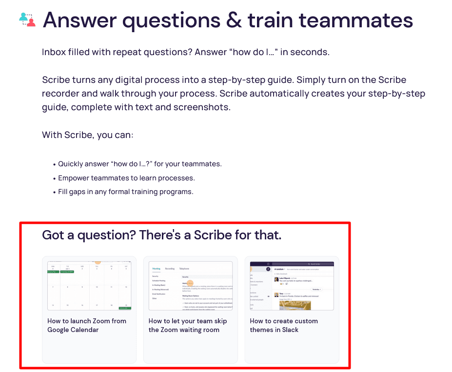
Source: Scribe
Above, you can see how they highlight one of the uses for their software—communication and interaction with your team members.
After briefly explaining how to use Scribe for that purpose, they allow users to explore it further by following links to the documentation about the specifics of that topic.
Use cases are undoubtedly valuable in highlighting your software’s best features and steering your users toward relevant documents.
Step-By-Step Instructions
One characteristic of excellent user documentation is that it’s accessible to all users.
Regardless if users are beginners or advanced, they shouldn’t have problems following or understanding user documentation.
That’s especially important when we talk about various how-to guides, user manuals, and other types of instructions.
If you want your users to be happy with your product, they need to know how to use its features, and they can do that only if you provide them with clear instructions.
That’s why top-notch user documentation relies on step-by-step instructions. Jan Musil from Accurity explains it like this:
Step-by-step guides are easier to follow, easier to understand, and offer a much more user-friendly experience than simply telling someone how to complete a task.
Furthermore, when you break down instructions into steps, you’re less likely to skip some part of the instructions that might seem obvious to you as an expert but not necessarily to a user who encounters your product for the first time.
For instance, the transit app Umo provides step-by-step instructions for most guides, even for simple tasks like changing the app’s language.
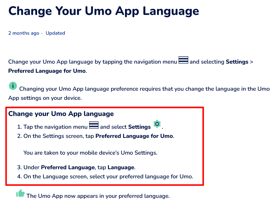
Source: Umo
Writing specific steps like in the example above prevents you from accidentally missing a piece of information and allows users to complete a task successfully.
Likewise, step-by-step instructions are also valuable for more complex tasks.
For example, Twitter provides step-by-step instructions for making the first request to their new API version.
It’s a complex guide aimed at users with significant technical knowledge, like software developers, so the steps are more detailed than in Umo’s example from earlier.
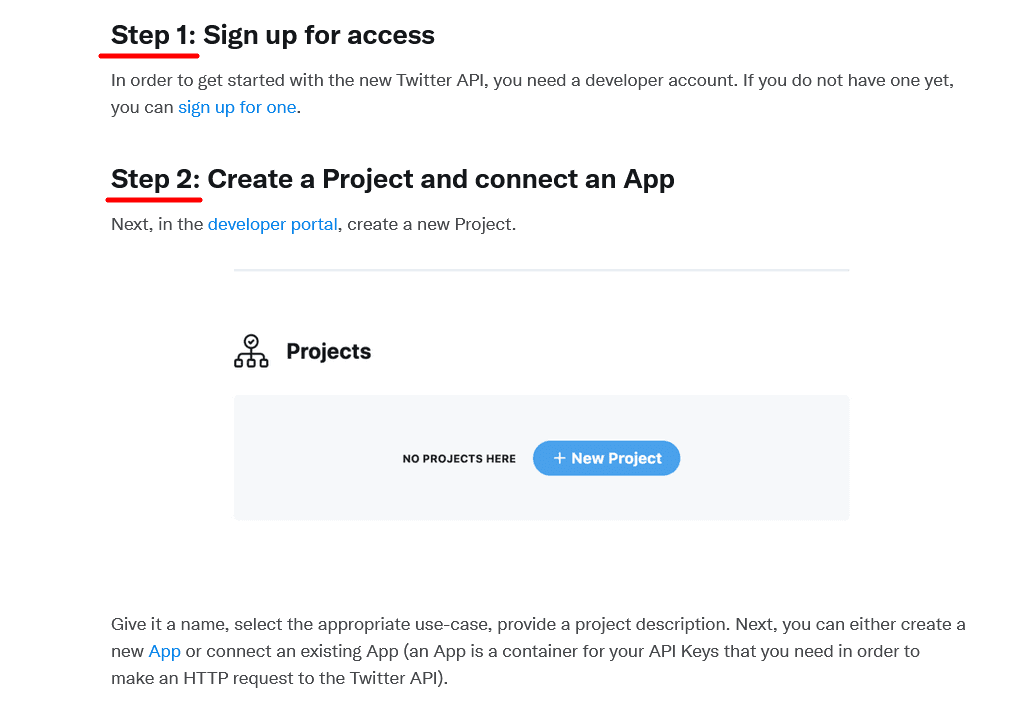
Source: Twitter
Twitter’s instructions contain only three steps, but due to the nature of the task, Twitter’s team ensured that they enriched them with links to other resources, code samples, and other helpful elements.
There are even additional step-by-step instructions inside step 3 of the main step-by-step guide.
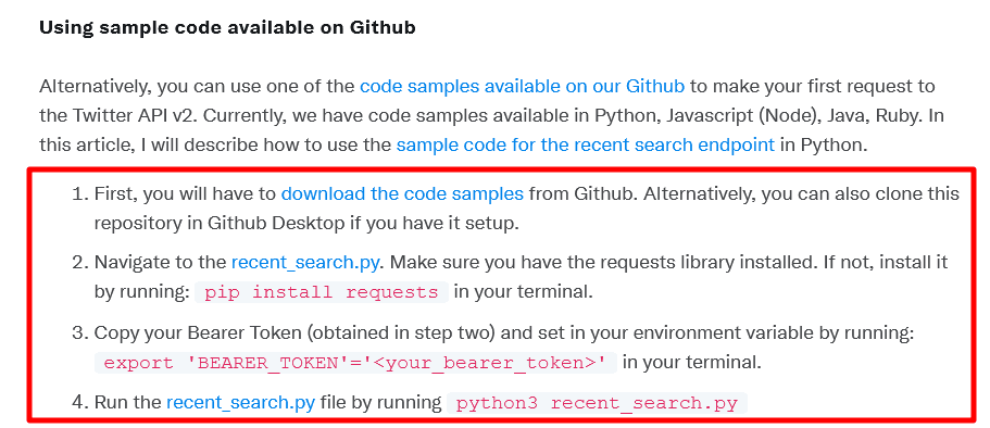
Source: Twitter
Breaking down guides into individual steps like this ensures a smooth customer journey to success.
The more detailed your instructions are, the less likely users will make a mistake in the process.
That means greater chances of completing the task, and it’s safe to say that documentation that leads customers to success is excellent user documentation.
Visual Content
You can raise the quality of your user documentation to the highest level if you include visual content.
Simply put, visuals are crucial for effective and efficient user documentation. They provide value to documentation that’s very difficult to replicate using only text.
Visual elements like images, screenshots, GIFs, videos, charts, graphs, etc. serve multiple purposes—they break up the text, so it’s easier to read, simplify the instructions, make them clearer, and generally convey information much easier.
As Ryan Knott, a marketing content specialist, puts it, visuals are often more effective than text.
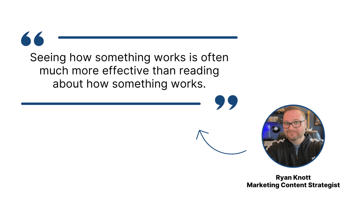
Illustration: Archbee / Data: Techsmith
Let’s see an example that illustrates that point.
Whereby, a video conferencing tool, has user documentation enriched with visuals that make instructions brief and straightforward.
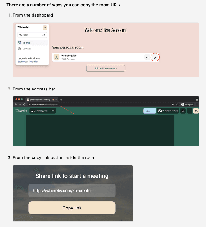
For example, you can invite people to your video meeting room, but to do that, you need to share your room URL.
There are multiple ways to do that, and Whereby’s team could explain each with many paragraphs of detailed instructions.
However, instead, they did it like this:
Source: Whereby
As you can see, they used three screenshots to show three ways of copying the room URL.
There’s one sentence for every method and one screenshot that shows users exactly what they need to do. Simple, efficient, and straightforward.
Another very useful type of visual is video. It allows you to present a significant amount of information in a short amount of time. In addition to that, people simply love watching videos.
According to research by Techsmith, 83% of respondents to their survey prefer watching videos to consuming information via text or audio.
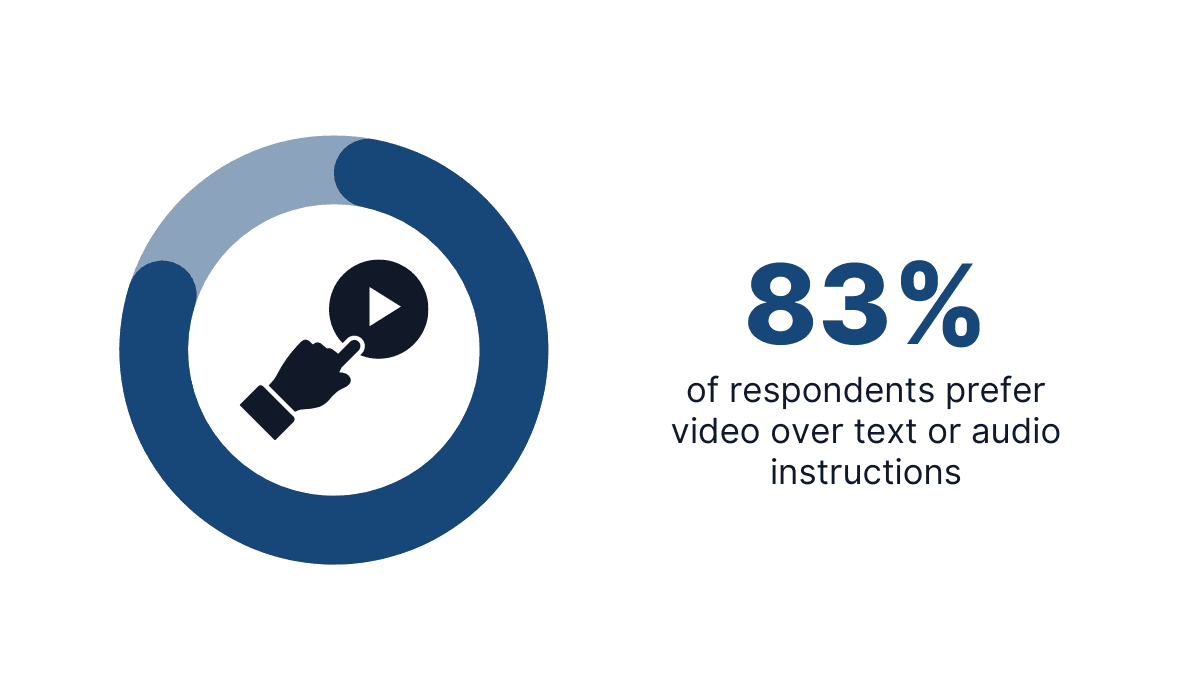
Illustration: Archbee / Data: Techsmith
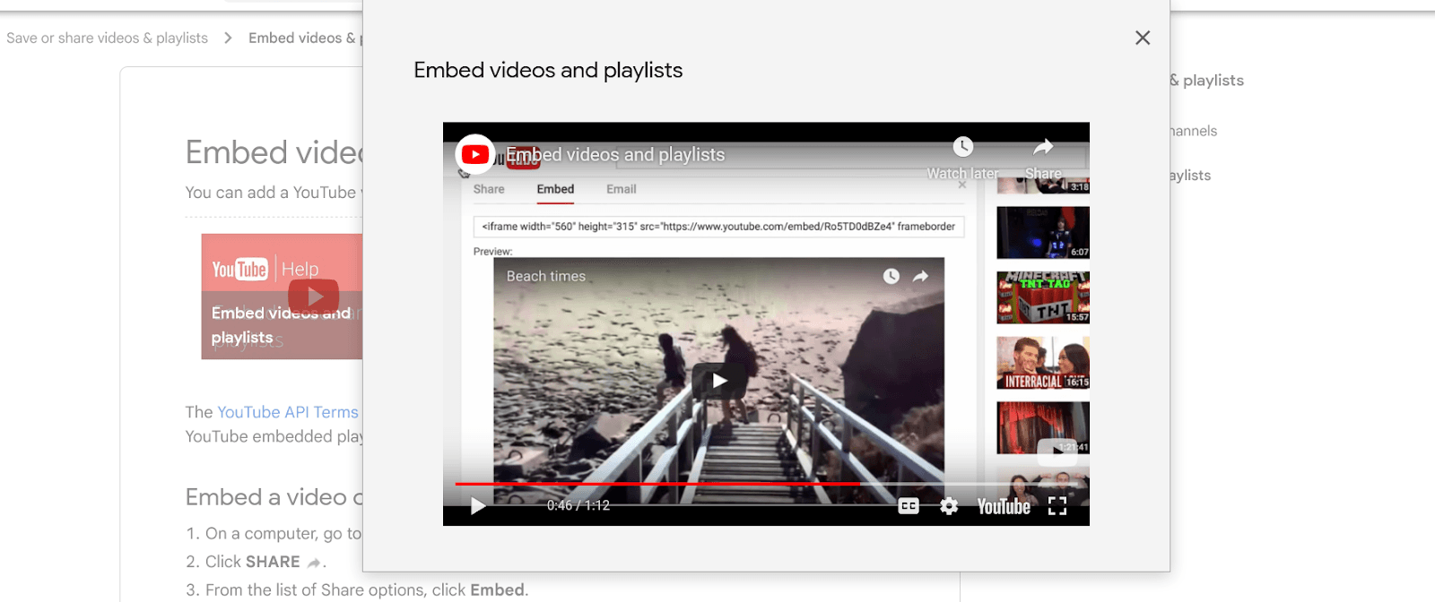
For example, YouTube documentation uses videos to accompany the text instructions.
Their help article about embedding videos or playlists has step-by-step instructions but also a video that illustrates those instructions.
Source: YouTube Help
That way, the users can get all the information they need to embed a video or playlist in around a minute-long video.
Visuals are a very efficient way to present information, and using them alongside your text is an excellent idea.
Links to Other Resources
Depending on the complexity of your software product, your documentation could be very detailed.
The amount of information in a comprehensive knowledge base can overwhelm users, but, at the same time, the solution isn’t to cut out valuable content just because there’s a lot of it.
So, what can you do to find the middle ground between those two situations?
One of the solutions is spreading your content into smaller articles and connecting them with links.
For example, instead of putting every detail about getting started with your product into one massive article, it’s a good idea to make an article that serves as a starting point with basic information and includes links to resources where users can learn more about specific topics.
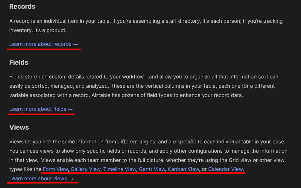
That’s how Airtable did it in their user documentation.
Source: Airtable
In the “Introduction to Airtable basics” article, Airtable’s team provided an overview of their product’s features but didn’t go into too much detail about each of them.
Instead, they included a link that leads to more comprehensive documents about specific features.
Microsoft raised linking to other resources to an even higher level.
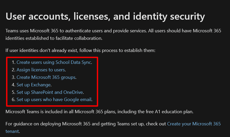
For instance, their documentation for Microsoft teams provides links to other resources in multiple ways.
Below, you can see a numbered list with a process for establishing Microsoft 365 identities, where every step is a link to a more detailed resource.
Source: Microsoft
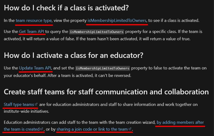
Microsoft also makes links a part of the text.
You can see that below, where we underlined all the links they’ve put into only three short paragraphs of documentation.
Source: Microsoft
Finally, there are also links to recommended content, which Microsoft’s team assessed as beneficial for the readers of a particular article.
They are at the bottom of every page in their documentation.

Source: Microsoft
The point isn’t necessarily to stuff your documentation with as many links to other resources as possible.
You can include three or 33 links, as long as they serve their primary purpose—to give users the opportunity to learn more about specific topics without overwhelming them with information in a single document.
Conclusion
Great user documentation doesn’t just appear out of thin air.
A lot of work needs to be done to create a resource that will be accessible to as many users as possible, help them successfully use your product, and fulfill their needs for knowledge and information.
Luckily, if your user documentation has features we’ve discussed in this article, you can be sure it’s an excellent resource.
If it lacks some of them, now you know how to make your user documentation great.
Frequently Asked Questions
Because structure is how users find answers fast. A clear hierarchy reduces cognitive load, speeds onboarding, and lowers support tickets by guiding readers from fundamentals to advanced topics in a way that matches how they learn.
What a good structure delivers:
- Findability: Users can scan, search, and land on the right page quickly.
- Clarity: Concepts build on each other (intro → setup → core tasks → advanced/edge cases).
- Consistency: Predictable patterns make docs feel trustworthy and easier to navigate.
- Scalability: New topics slot into a known place without creating chaos.
Practical ways to structure your docs:
- Lead with "Getting started" and foundational concepts before advanced features.
- Group by job-to-be-done, feature, role, or workflow (pick one primary lens and stick to it).
- Use progressive disclosure: short overviews that link to deeper, focused articles.
- Standardize navigation: document trees, breadcrumbs, consistent titles, and naming.
- Tag and cross-link related topics (prerequisites, related tasks, glossary).
Quick checklist:
- Does each page answer one main question well?
- Are titles action-oriented and consistent (e.g., "Create", "Configure", "Troubleshoot")?
- Can a new user get from home → answer in three clicks or fewer?
- Are search terms and synonyms reflected in headings and keywords?
Measure impact with metrics like time-to-first-value, search success rate, and ticket deflection.
